In today’s competitive environment, branding plays a key role. Its purpose is creating a strong corporate identity. Are you starting a business or planning to redesign an existing brand? One of the important parts of this process is designing a logo that will represent you visually in the long term period. However, publication of the logo in many places is not enough. Efficiency lies in long-term brand building. You have to „cultivate“ the position of the brand on the market, and therefore branding is only an initial but necassary step.
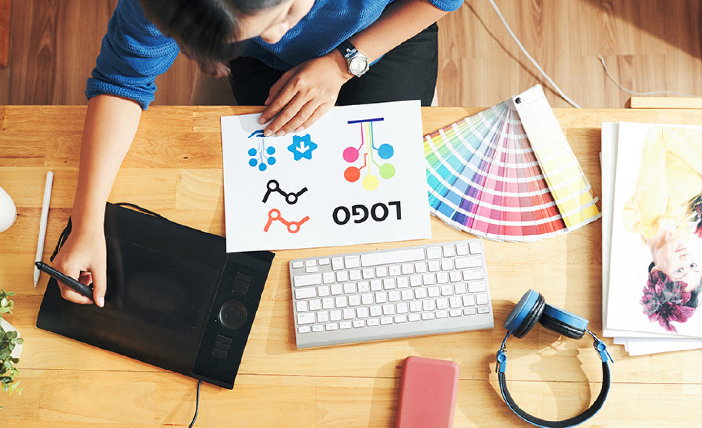
What does the brand represent?
Consumers perceive the brand as part of the product. They often remember their favorite products based on the logo or brand identity. The creation and then use of a brand increases your awareness on the market. Branding will help your customers to remember your brand faster.
What is branding?
Branding is much more than just a logo, color or font that represents your company ; it includes the overall impression and experience consumers have with your company. It is the combination of tangible and intangible elemets that differentiate your business from the competition.
Branding includes various components such as logotype, typography, color paletter, message, brand voice and overall visual identity.
Rebranding and redesign
Rebranding has several phases. Which one you choose depends on you and the current visual of your brand. Rebranding can mean changing the brand name. But it can also be a complete change, which can include a new brand identity, logo, slogan, but also a new focus of the brand or a new philosophy with which the brand presents itself on the market. These changes often involve a change of the brand’s position on the market or an overall change in the target market. It may happen that there is a change in consumer preferences and the brand is forced to change its business strategy.
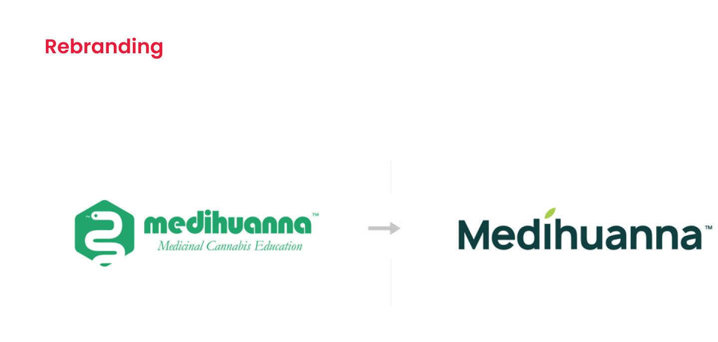
Redesign includes making improvements or changes to an existing design while retaining its main elements. The goal is to enhance functionality, visual appeal or user experience.
Unlike rebranding, a redesign is just a change in the meaning of the brand, while the name usually remains. The logo, color scheme or typography changes. In involves improving the existing design while keeping its main elements. The goal is to enhance functionality, visual appeal or user experience.
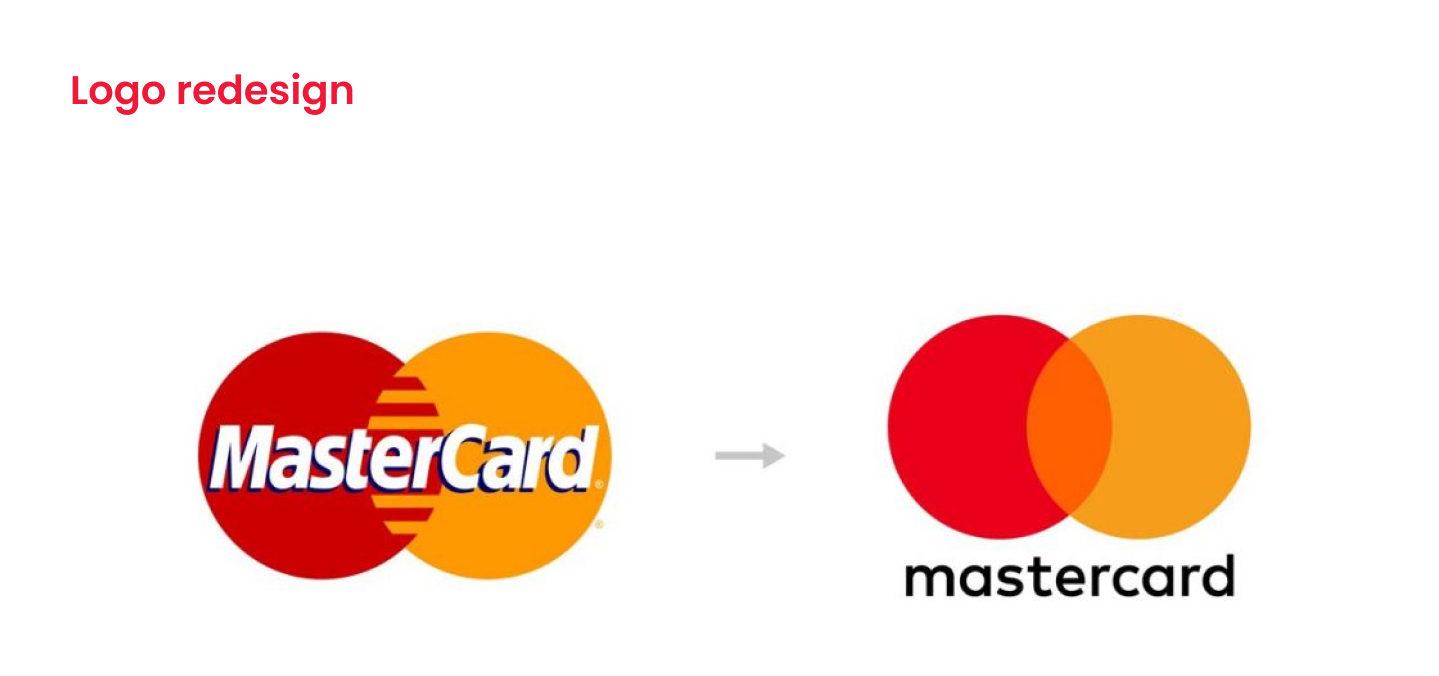
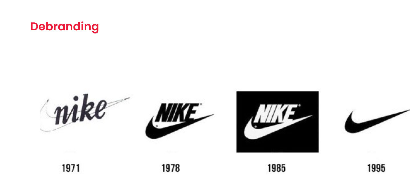
Although both words have resonated strongly in the world of graphics and marketing in recent years, it is definitely not true that this strategy is used only among brands that are outdated or unaesthetistic. In fact, a redesign can help even a well-managed brand, if the logo and visual style lack a graphic element that would suit it, or the intention is to fundamentally change the style or the whole business focus of the company.
5 basic types of logos
We are able to distinguish 5 basic logotypes. Each of them has its pros and cons. Do you know which one suits your company and why?
Symbol (Logomark / Icon)
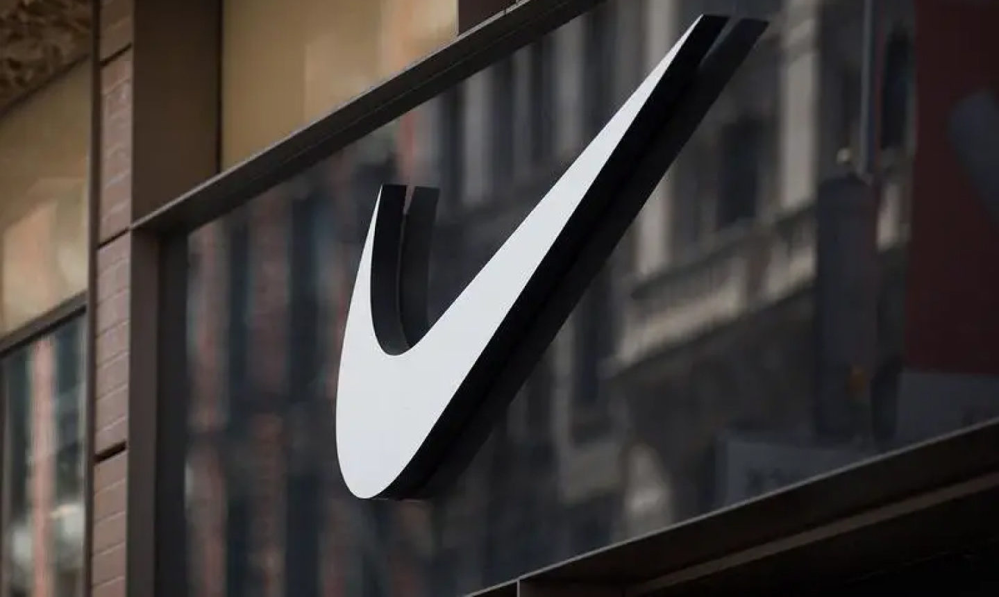
A symbol is a graphic or visual representation of a brand that does not contain any text. It uses a recognizable symbol, shape or combination to represent the brand. The symbol is often abstract and may not reveal exactly what you are doing at fist glance. However, it should resonate with your target audience. Examples are iconic symbols that suggest dynamism and speed. This is exactly the target group of this brand (Nike).
Because the symbol is often abstract, the resulting logo is original and not generic. It evokes a feeling, not a specific thought. Therefore, it is not suitable for brands that are not precisely defined and do not know what feeling they want to evoke with the symbol.
Word mark
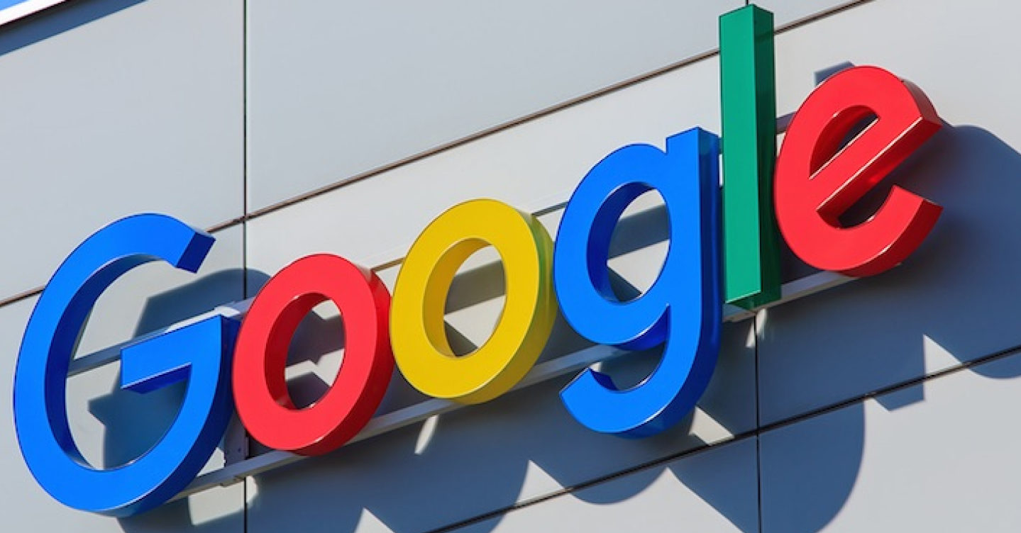
The so-called Logotype. This is a variant that contains the full name of the company. The main element here is the typography, which is often stylized or hand-edited. The shape, style and colors must match the company’s philosophy. Examples include Coca-Cola, Disney or Google. The Google logo has a playful feeling and the different colors represent the full range of products and services it offers.
It is an ideal choice for new companies that want to get their ,often, abstract name on the market. It is also suitable for people who present their company under their own name. Not suitable for companies with a long name.
Monogram (lettermark)
Monogram logos are made up of letters – usually the initials of a company, brand or individual. These logos create a unique and recognizable visual sign that is a combination of two or more letters. It is popular if they overlap. A perfect example of a monogram logo is the LV brand Louis Vuittion. It is popular type among companies with long names. However, the conncection with the real name of the company may not be immediately clear from the initials.

Emblem
It is a combination of a symbol with a word or initial and a shape that is essential for the logo. It gives the company an official touch and historical character. A typical choice for universities, state administration, sports and other institutions. Examples are Starbucks or Harley-Davidson, both of them include a circular emblem with text. Thanks to this type of logo, even a new company can act like a company with a long tradition. It is not suitable on the places where the logo will be diminished normally, because the emblem will be unreadable.
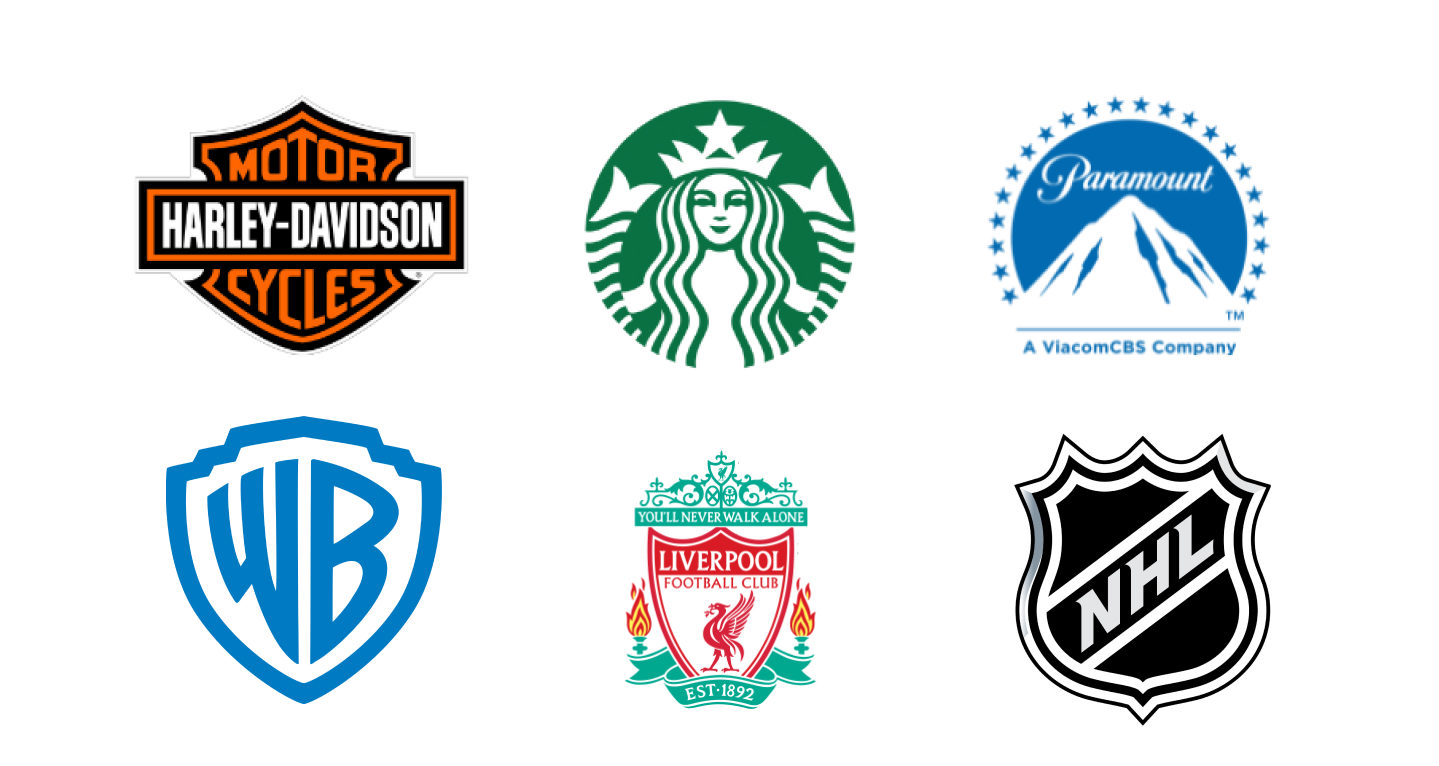
Combination of word and symbol mark (combined mark)
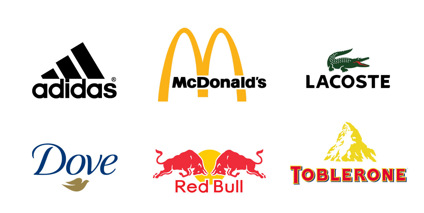
This is the most flexible type of logo. Depending on the platform, media or intended purpose, the symbol alone, the title alone or a combination of both can be used. This type of logo enables quick brand recognition. An example of combined brand is the McDonald’s logo, where the arch is iconically combined with the wordmark.
What branding best suits your brand?
Let’s find out together. We are a digital agency dealing with branding, marketing, graphics and IT. We will be glad to create a unique identity for you taht will become a brand! We care about your satisfaction and we make sure that our strategy brings you optimal resources.

